
Hylo Urgent Care
DELIVERABLES
- Brand Identity
- Nomenclature
- Brand Logo
- Brand Voice
- Website
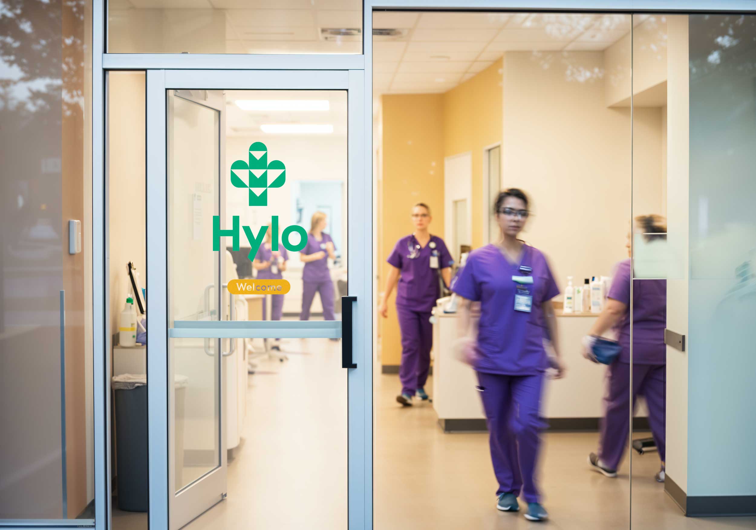
- Signage
IMC, a family-owned urgent care clinic, needed a brand that clearly conveyed its role in bridging the gap between emergency and primary care—especially in an underserved region. By renaming it Hylo and creating a warm, approachable identity, we redefined what urgent care could feel like: accessible, high-quality, and compassionate.
CHALLENGE
Urgent care often feels sterile and impersonal, and IMC’s existing brand lacked the clarity and impact to communicate its critical role in an underserved community. Dr. Damen Hershberger wanted a brand that was not only modern but also welcoming and reflective of the clinic’s mission.
SOLUTION
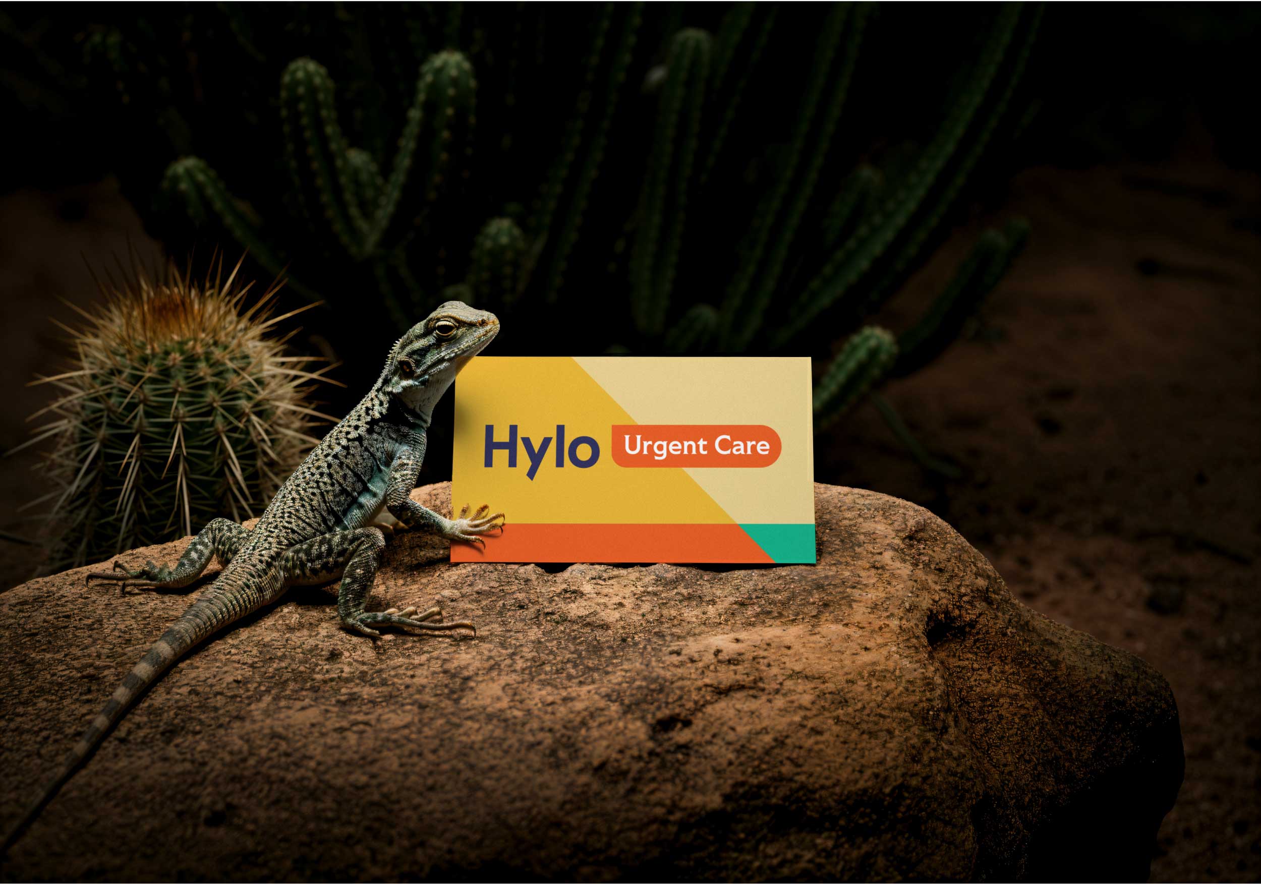
We developed the Hylo name to represent the highs and lows of everyday health, paired with a fresh, modern logo that symbolizes both care and resilience. The brand identity—featuring warm, calming colors and southwest-inspired elements—was applied across signage, apparel, and interior design, reinforcing Hylo as a trusted healthcare oasis.

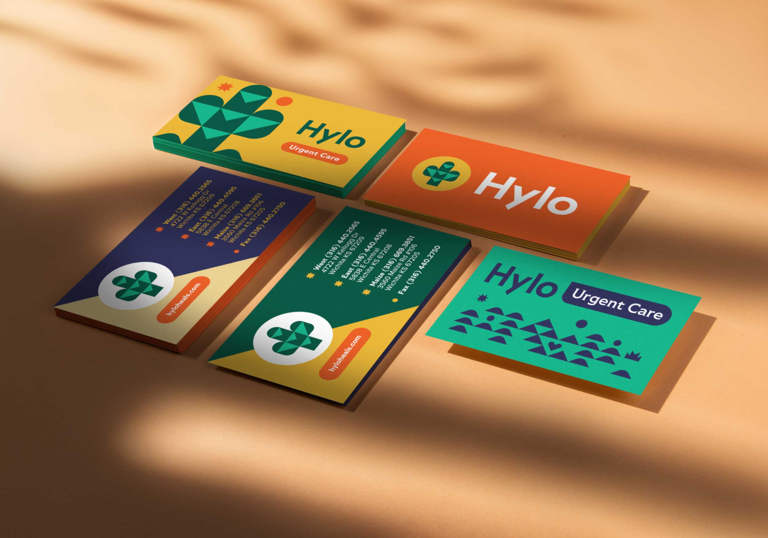
Logo
The new logo symbolizes help in the midst of a healthcare desert. It combines a medical cross with a cactus, while downward-pointing arrows emphasize that care is accessible right here, right now.
Hylo Name
Hylo was created to capture the emotional journey of navigating the highs and lows of health. It reflects the clinic’s role in bridging the gap between emergency care and primary care schedules, providing reliable, immediate support when it’s needed most.
The previous brand name and logo were straightforward, focusing solely on the name and acronym. Under new ownership, we evolved the brand to evoke emotion—an essential element in creating a meaningful and memorable identity.
The new website is a dramatic transformation from its predecessor, which lacked engagement and struggled with user interaction. Designed with Southwest-inspired brand elements, it now delivers a more immersive and inviting experience.
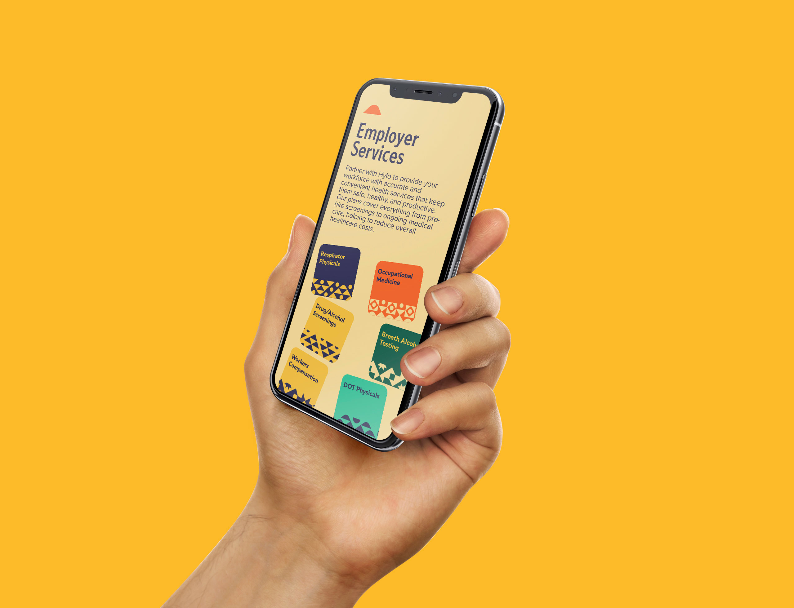
With most visitors accessing the site on mobile devices, it was crucial to ensure every aspect of the experience translated seamlessly from desktop to mobile, maintaining a consistent and user-friendly online presence.
A variety of custom icons and illustrations were designed to provide flexibility across signage and marketing materials, ensuring a cohesive and adaptable brand presence.
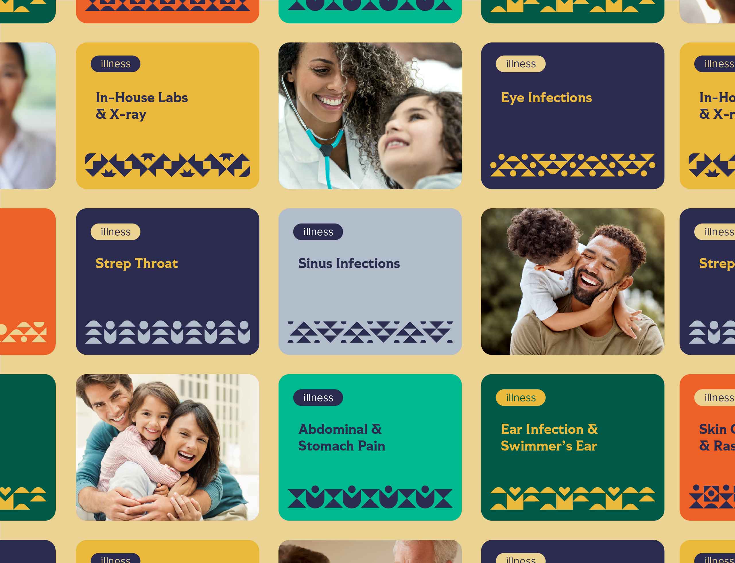
A series of digital cards were designed to present illnesses in an approachable and playful way, making the information more engaging and easy to navigate on the website.
Project Outcome
How Hylo Stands Out in Urgent Care
With its new name and identity, Hylo Urgent Care stands out as an accessible and compassionate provider in a healthcare desert. The branding communicates both expertise and warmth, making urgent care feel less intimidating and more inviting to the community it serves.
The rebrand made Hylo impossible to miss—you can’t drive by without noticing it. More than just a new look, it created a welcoming experience that truly reflects our commitment to accessible, compassionate care.
– Damen W. Hershberger, M.D., Owner