
Kansas Health Foundation
DELIVERABLES
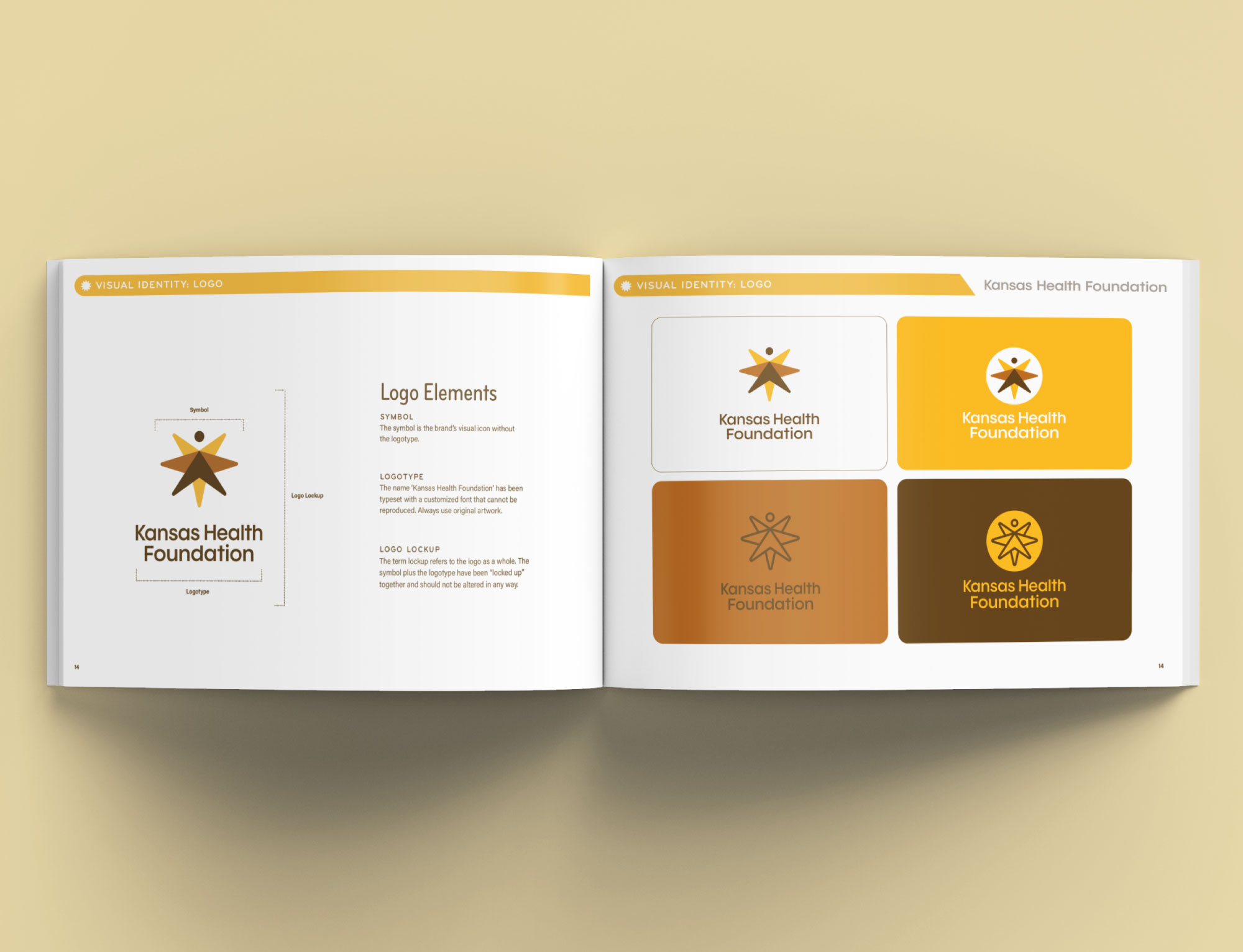
- Brand Identity
- Logo
- Brand Guidelines
For more than four decades, the Kansas Health Foundation (KHF) has been a guiding force in making Kansas healthier. To honor that legacy and prepare for the future, KHF needed a refreshed brand identity that reflects resilience, growth, and its enduring commitment to communities across the state.
CHALLENGE
KHF’s long-standing logo carried deep meaning but was beginning to feel dated, particularly in digital environments. The typography and symbol no longer fully reflected the modern, forward-looking vision of the foundation.
SOLUTION
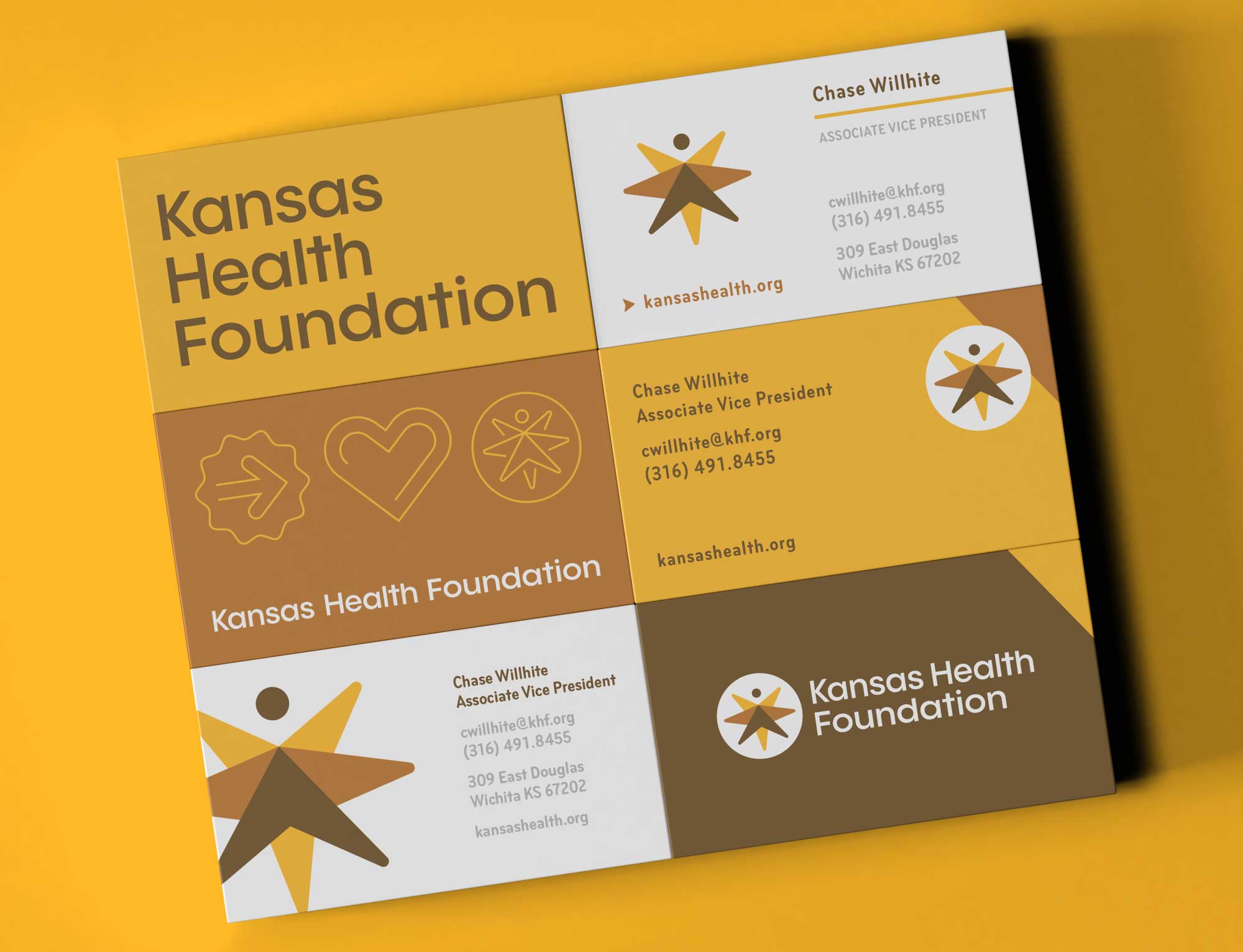
The logo was updated with careful modifications—modernized typography for clarity and digital adaptability, along with refined symbol that made it more versatile. These updates preserved the legacy of the original while ensuring the identity worked seamlessly across modern platforms.
Old Logo
The original logo represented stability and commitment but was developed in a pre-digital era. While meaningful, its typography and proportions were less adaptable across today’s wide range of digital and print applications.
New Logo
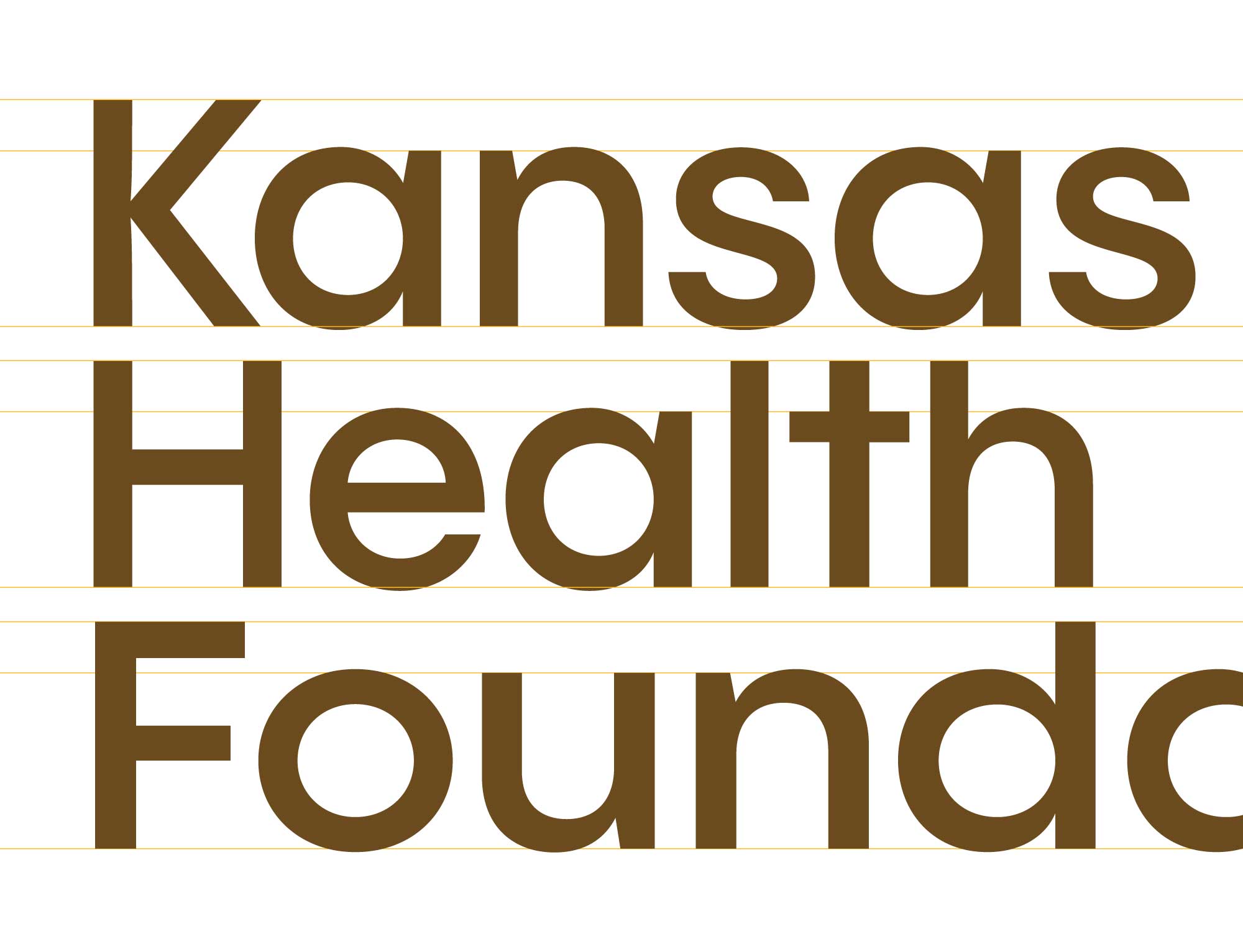
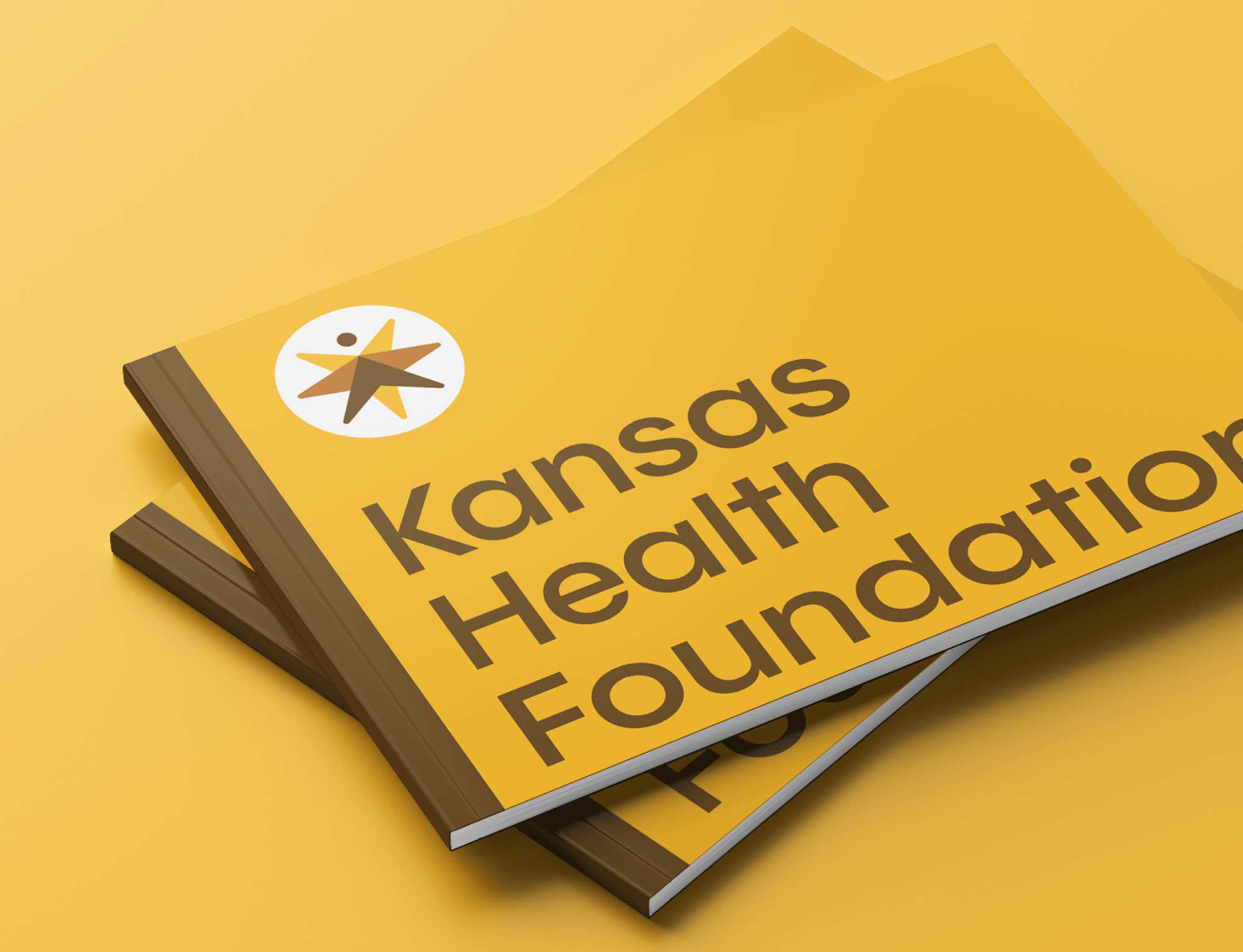
The refined logo keeps the strength of the original mark while modernizing it for the future. Updated typography offers a cleaner, more contemporary feel, while subtle adjustments to the symbol create greater balance and versatility. Together, these refinements ensure the logo communicates KHF’s mission with clarity while remaining effective across all platforms.
Modernized typography and logo refinements, including a high-functioning one-color version, ensure clarity across both digital and print applications.

Celebrating four decades of impact with a refreshed identity and brand guidelines that honor KHF’s legacy.


Project Outcome
A Timeless Symbol, Ready for the Future
The refined logo and brand system provide KHF with a modern, versatile identity that works seamlessly across digital and print while staying true to its mission. The outcome is a brand that feels both timeless and forward-looking—anchored in resilience, rooted in community, and guiding Kansas toward a healthier tomorrow.