
Greyten
CLIENT
- Greyten
- Agency: Colab
INDUSTRY
- Architecture + Interior Design
DELIVERABLES
- Logo Design
- Brand System
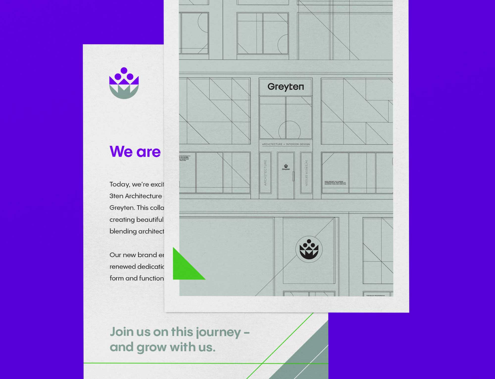
Greyten was born from the merger of 3ten Architecture and Thomas Grey Interiors, uniting bold vision with refined craft. Their new identity needed to capture the harmony of form and function while honoring their shared history.
CHALLENGE
Two established firms, each with their own legacy, came together with a single vision: to create a brand that expressed the balance of beauty and practicality. The challenge was to develop an identity that celebrated this union and positioned Greyten as a modern leader in architecture and interior design.
SOLUTION
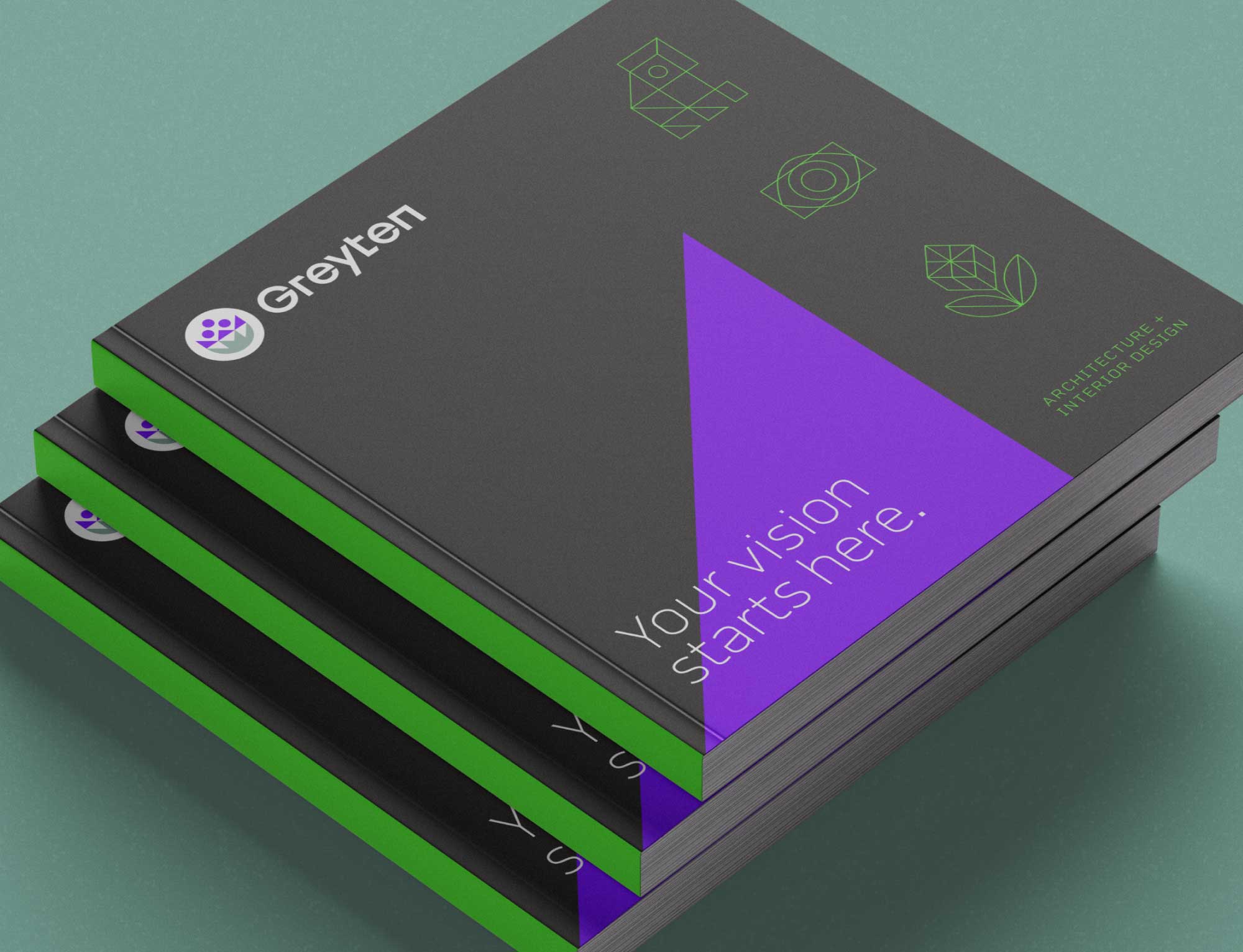
Brain Sinew crafted a brand identity rooted in the concept of transformation—spaces that inspire, endure, and impact communities. At the heart of the brand is a logo and name that symbolize unity, intention, and creativity, aligning perfectly with Greyten’s belief in design that shapes lives.
Logo
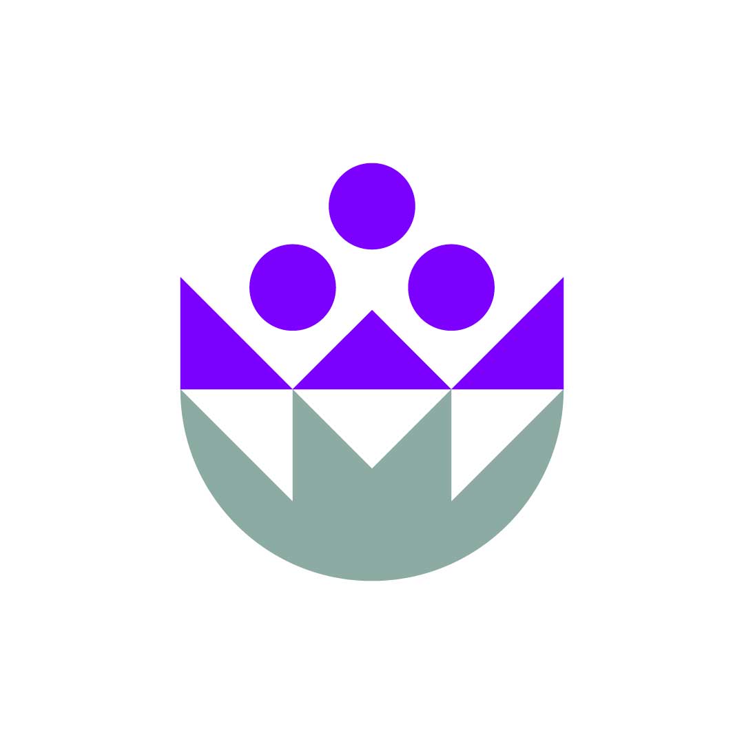
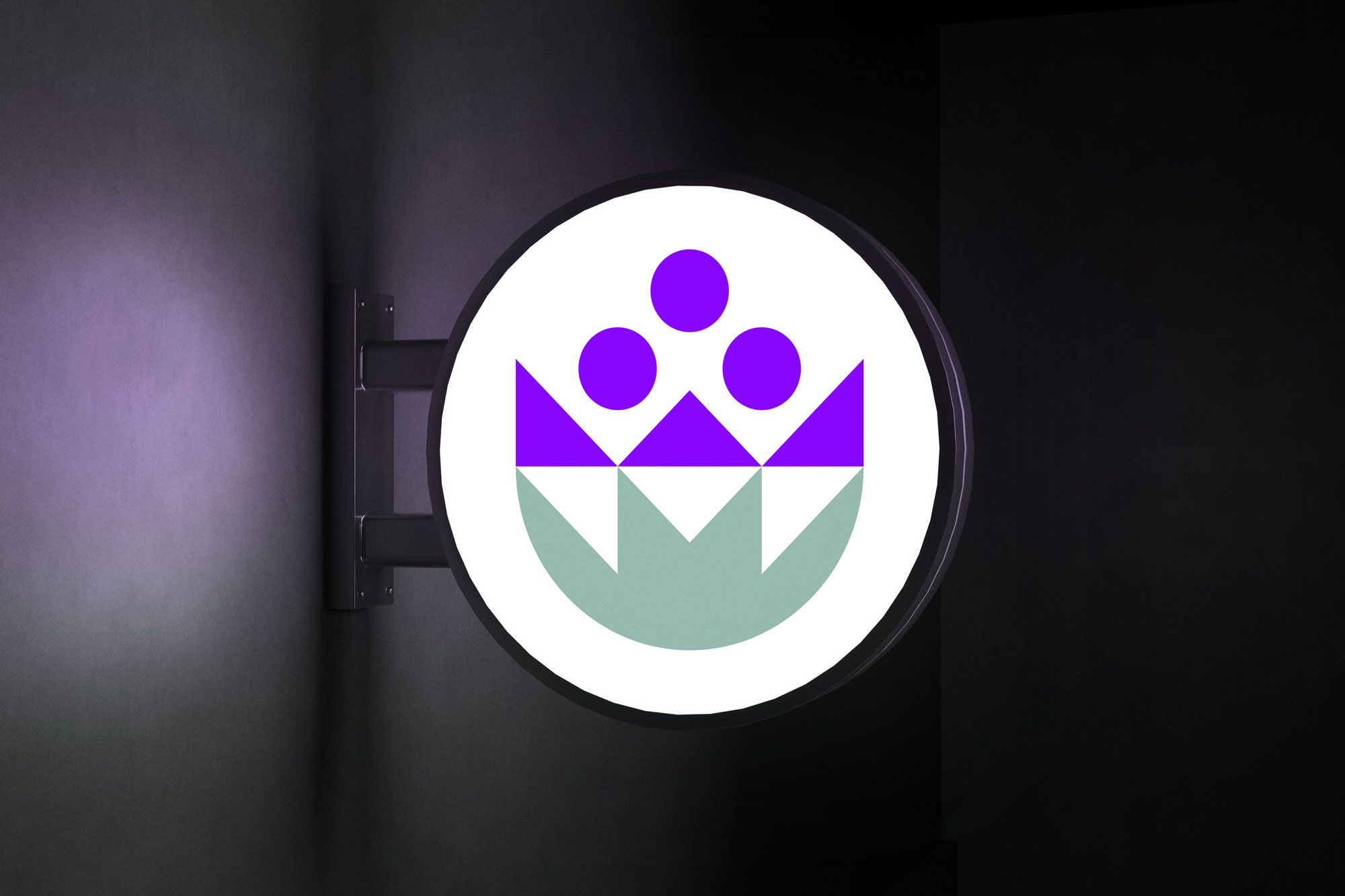
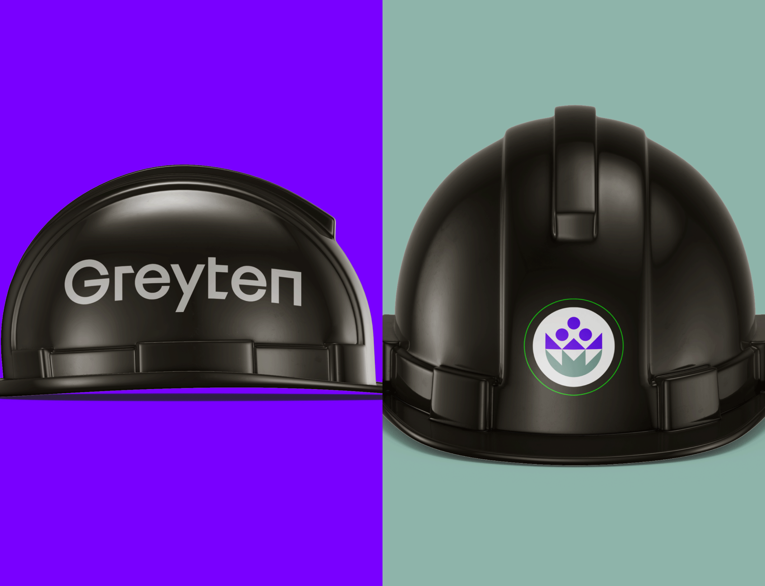
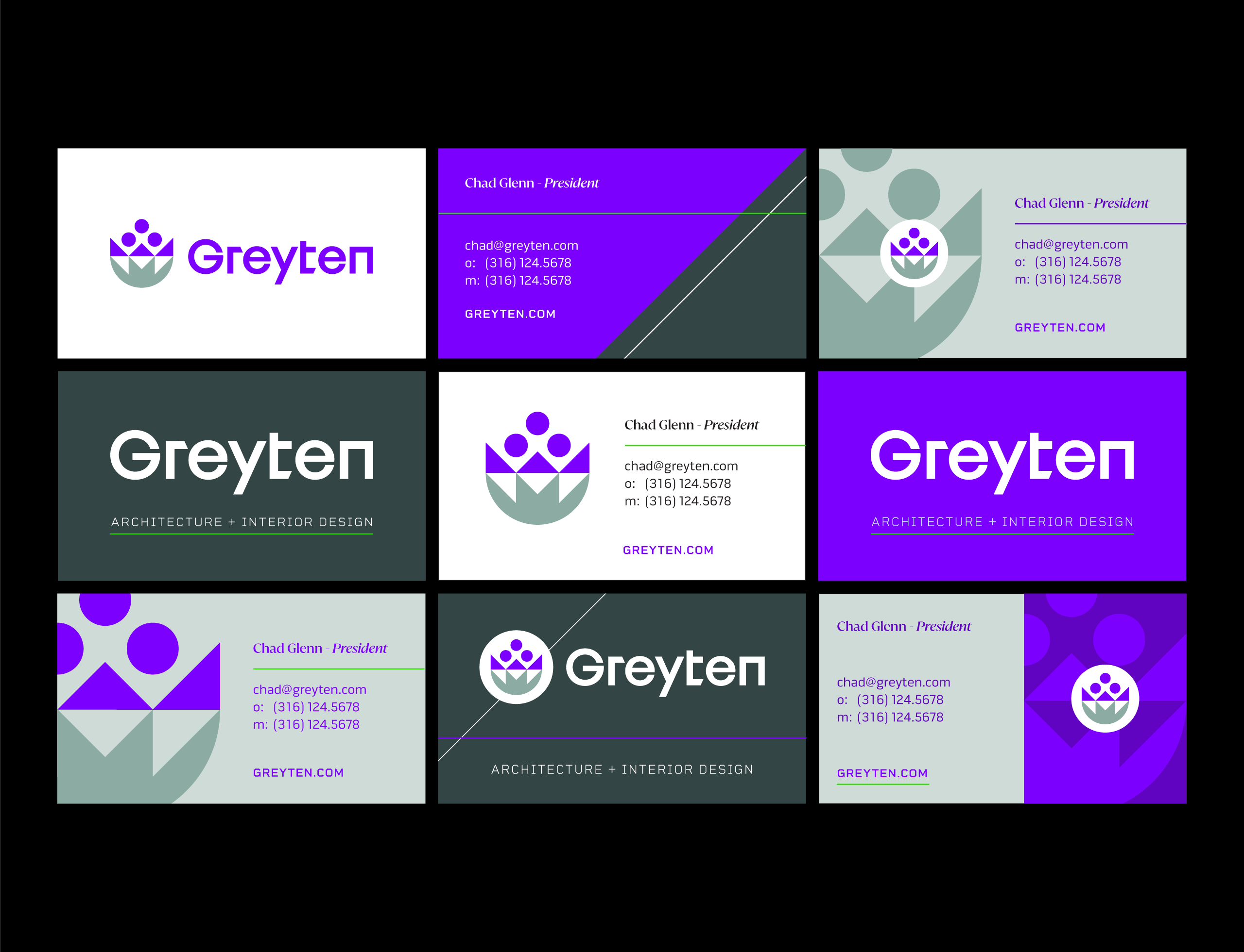
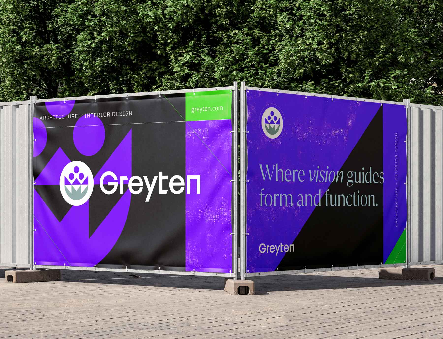
The Greyten logo is a geometric flower—a bold, modern wildflower symbolizing resilience and beauty. Its structured lines reflect order and intentionality, while hidden rooflines nod to architecture. Three circles represent collaboration and people at the center of design, and a horizon line conveys community impact. Together, these elements embody Greyten’s mission to design environments where form and function thrive in harmony.
Name
The name Greyten honors the histories of 3ten Architecture and Thomas Grey Interiors, combining them into a single, modern identity. More than a name, it represents a forward-looking brand rooted in unity, strength, and creative purpose.
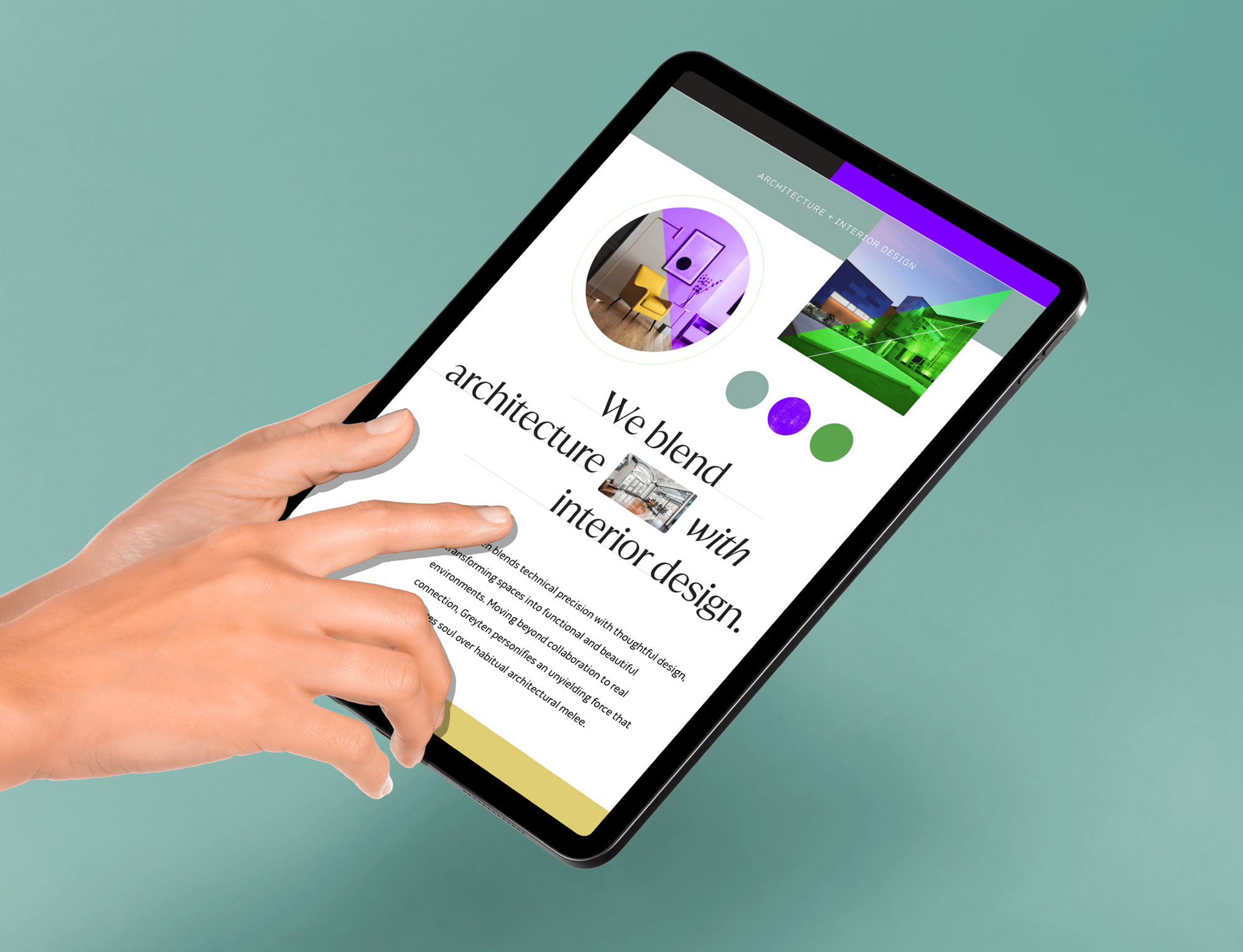
Greyten’s identity is rooted in the harmony of form and function, uniting beauty with usability in every space. The geometric flower symbolizes collaboration, resilience, and transformation—reflecting designs that evolve with people while standing the test of time. Blending organic inspiration with structured precision, Greyten embraces innovation, intentionality, and sacred geometry to create purposeful spaces that inspire and endure.

The use of simple geometric shapes connects to sacred geometry, alluding to the notion of divine inspiration and intentional design. This principle highlights Greyten’s belief in purposeful spaces, where every room and structure is part of a greater, harmonious design.
Project Outcome
A Unified Brand for a Bold Vision
Greyten’s new identity positions the firm as a transformative force in architecture and interior design. By blending beauty with functionality, the brand communicates their promise: to create remarkable spaces that inspire, endure, and leave a lasting impact.