
When your business starts to outgrow its identity, your brand can become a roadblock rather than an asset. Here are five scenarios where rebranding is the key to unlocking your organization’s next chapter:
1. You Want to Expand Into Larger Markets
Your brand should set you up for success on a bigger stage, whether that’s national or global.
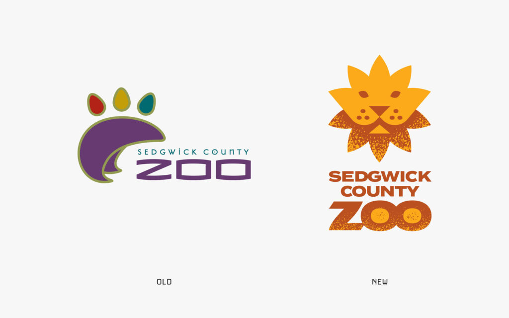
Sedgwick County Zoo
The Sedgwick County Zoo, a highlight of Wichita and one of Kansas’s top attractions, had a logo that didn’t reflect its global aspirations or Kansas roots. Despite being an international leader in wildlife conservation and earning numerous awards, the zoo often struggled to align its brand with its local identity.
During my research, I found that most zoo logos were generic and lacked a strong sense of place—a missed opportunity for the Sedgwick County Zoo to stand out. To address this, I worked closely with the zoo to design a logo that celebrates Kansas and reflects its broader, often underappreciated mission. By merging key symbols, I combined the “king of the jungle” with Kansas’s state flower, the sunflower, to create the Kansas Lion. This design connects the zoo to its local heritage while highlighting its leadership in the conservation of “wildlife and wild places.”
The rebrand positioned the zoo to better compete for global grants and partnerships, reinforcing its role as both a local treasure and an international leader. (Agency: Work done for Gardner Design)
2. You Lack Clear, Distinct Ownership in Your Market
A strong brand identity sets you apart, giving your audience a clear reason to choose you over the competition.
The District Church
The District Church wanted its brand to reflect its mission to love and transform the Delano community. Its old logo, a simple letter “D,” didn’t connect emotionally or stand out.
After meeting with church leaders to deeply understand their identity, I designed a logo that symbolized love through intertwined hearts encircling the district, represented by a square in negative space. To signify transformation, I incorporated a spark into the center. The result was more than just a visual identity—it became a powerful emblem of the church’s mission to welcome and make a lasting impact on its congregation and the Delano community.

The new identity was a perfect fit for the District Church’s vision and created a stronger sense of connection with its community.
3. You’re Not Attracting the Next Generation of Customers, Members or Employees
An outdated brand can struggle to connect with younger audiences who value fresh, modern, and inspiring identities.
The Forum
Formerly known as the Kansas Family Business Forum (KFBF), the organization recognized that its branding wasn’t resonating with younger members.
The first step was simplifying the name to “The Forum,” expanding its scope beyond “business” to encompass larger family enterprises. A fresh logo replaced the confusing acronym, incorporating symbols like a roundtable, compass, and star to reflect The Forum’s mission: uniting and guiding family enterprise leaders toward shared success.
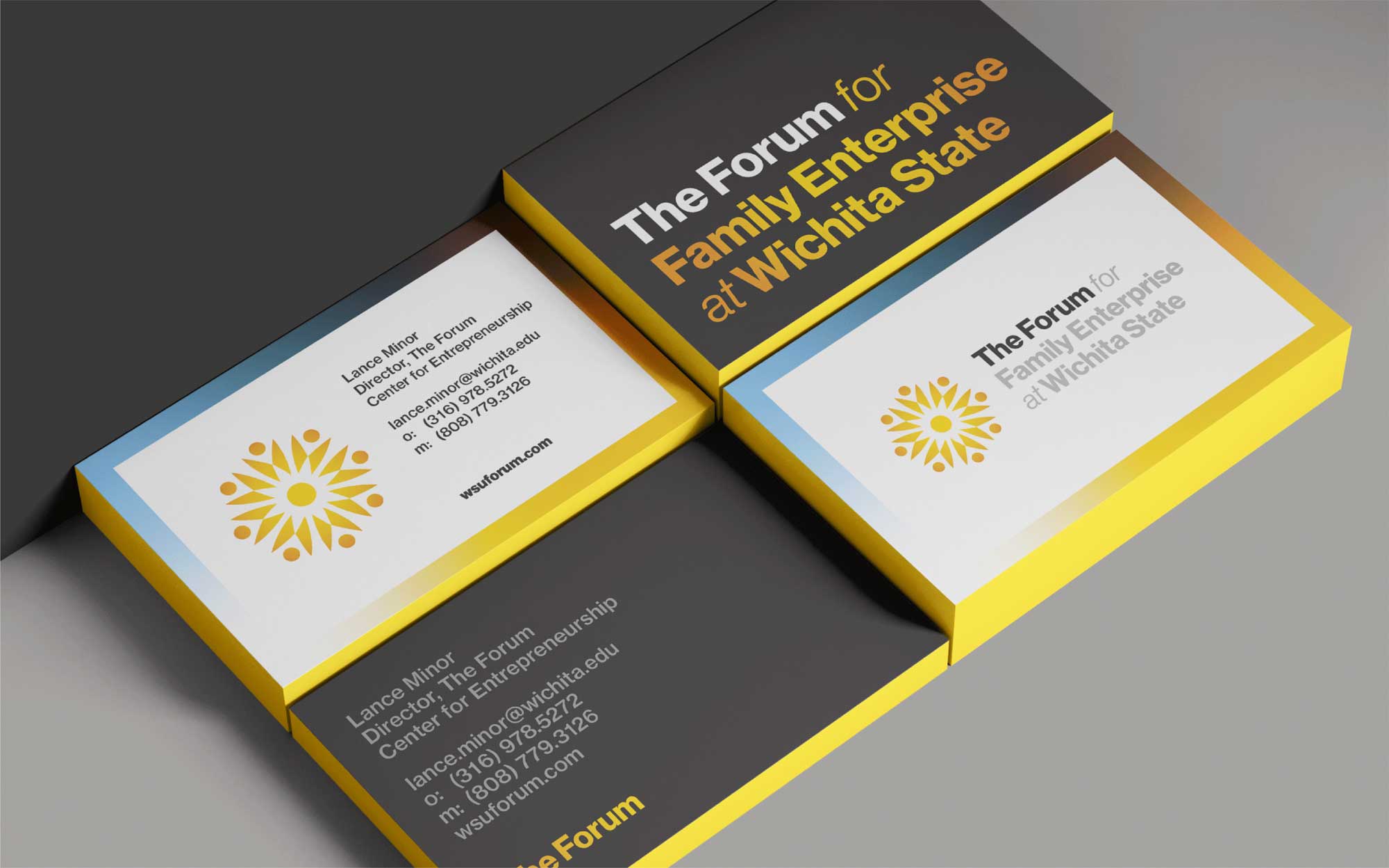
This rebrand made The Forum modern, relevant, and appealing to the next generation of business leaders, all while inspiring a renewed sense of belonging among its members.
4. Your Current Brand Is Limiting Your Growth and Understanding
If your brand no longer reflects the full scope of your capabilities, it could be holding you back from reaching new heights.
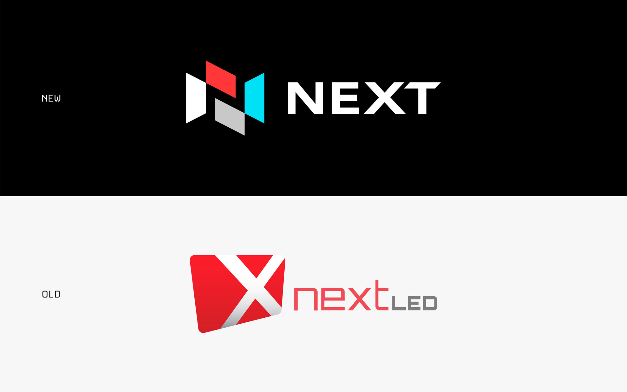
Originally a distributor of LED panels, Next evolved into a leader in sign communication. However, its outdated branding no longer reflected this transformation.
To address this, we removed “LED” from the name, allowing the brand to break free from its association with a single product. The updated logo integrated digital screens into the letter “N,” symbolizing the company’s advanced capabilities and strategic mindset. The new tagline, “Build an Authentic Message,” reinforced Next’s commitment to helping businesses communicate effectively and meaningfully.
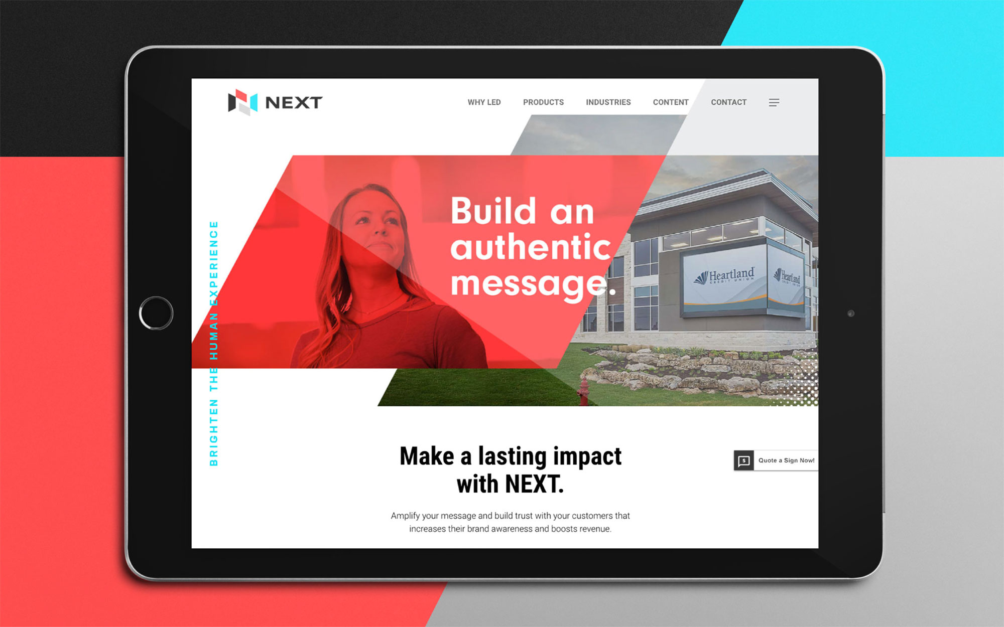
This rebrand positioned Next as an industry leader and opened doors to new opportunities, aligning its identity with its broader vision.
5. Your Current Branding Is Misleading
A misaligned brand can create confusion, undermining trust and limiting your ability to showcase your true value.
RedGuard
RedGuard, previously known as A Box 4 U, is a leader in blast-resistant buildings. However, its old name and logo caused confusion, with many assuming it manufactured cardboard boxes.
During the rebrand process, it became evident that the company needed a name and identity that better showcased its expertise and core qualities. The result was RedGuard—a bold, authoritative name supported by a logo that embodies safety and protection, effectively eliminating any confusion with flimsy cardboard products.
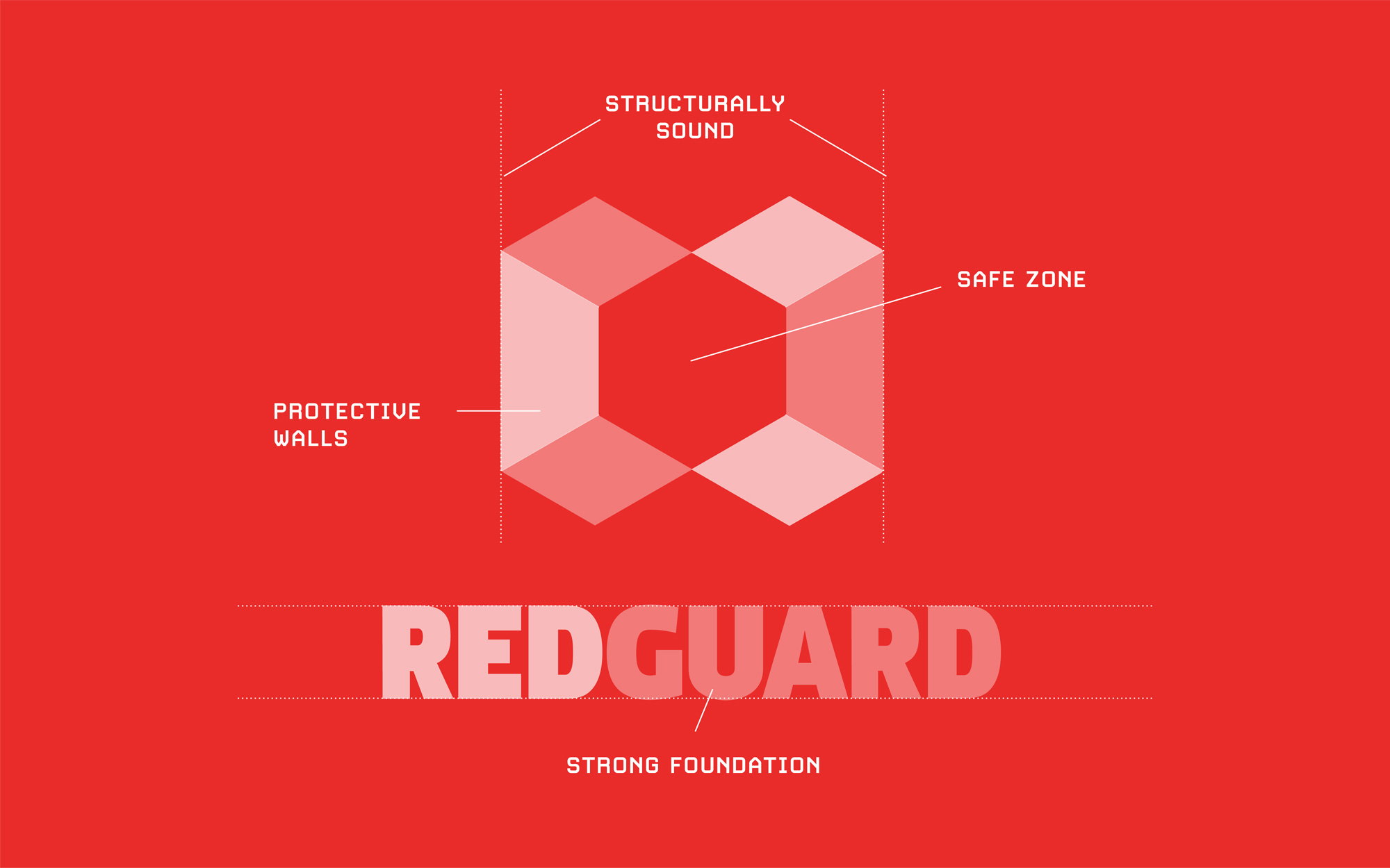
This transformation not only built trust and credibility but also solidified RedGuard’s leadership in the industry. It gave them the confidence to communicate their true value to clients and partners. (Agency: Work done for Gardner Design)
A successful rebrand does more than give you a new logo—it changes how your audience sees you, aligns with your goals, and sets you up for long-term growth. Could it be time for your organization to rebrand?

Meet Brian.
He’s the brains behind Brain Sinew. Brian has worked as a design leader for more than fifteen years, working with national brands and local mom and pop shops. His wild passion for brand building and design is driven by simple storytelling and tried-and-true strategy. He believes that when your brand clicks with your tribe, the connection brings an energy — a movement — that propels your business forward.